Mary Poppins
Objectives (continued)
To me, you have to read the script, and then dig even further.This play takes place in London, in 1910. Think first episode of Downton Abby. Queen Victoria had died nine years earlier, and her son Edward was on the throne. Think generation gap, the height of the industrial era. Women’s roles in society were in flux, which is a major theme in the Mary Poppins books. P.L. Travers took a sunny and optimistic view of this, very different from the views of other writers at the time. For example, Henrik Ibsen’s A Doll’s House shows a woman treated in a manner very similar to the way the mother is treated early on in the Mary Poppins; Hedda Gabler reminds me of Mary herself; and in The Master Builder the main character is beguiled by a magic creature in a similar way to the father in our story, but with tragic results. But that’s an entirely different discussion.
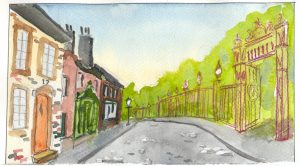
By now you’re probably saying “He’s way over-thinking this.” And you’d be right. So let’s dial back the analysis. What we’ve got here is the kids just trying to be kids in a straight-jacket world; Mary Poppins vs. Cruella DeVille, alias Miss Andrews; a basically nice guy, Mr. Banks against the establishment; etc. To make it work, we have to engage and enchant the audience (at least the youngsters). For me, it doesn’t so much matter that the gates to the park are recognizable as the entrance to a real park, it really means make it attractive, and help keep it snappy.
Making it Real
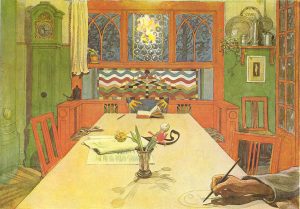
I use dichotomies in the script to inform my design. In the script itself, the park is a dismal, boring place until Mary arrives and makes it wonderful. The bank is stark and dark, dehumanizing. To contrast that, I’m making the home cheerful and bright. The colors are patterned after the paintings and illustrations of a Swedish artist, Carl Larsson. Working at around the time Mary Poppins takes place, he painted many idealistic domestic scenes with a palette of warm, soft greens, pale oranges, soft gold colors. Here is the tail piece from his book, A Home on Sunnyside.
The interior of the family home
After the last performance of NBCT’s Young Frankenstein, Cliff took me through the set, with its revolving bookcase and all. Could I use it as the basis of the interior of the family home in Mary Poppins?
Here is a sketch of the set, minus the walls and revolving bookcase:
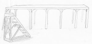
Stripped of its covering it was basically a platform, six feet high, the width of the stage, and three feet deep; three feet from the back wall of the theater. There was a sturdy, yet movable staircase the height of the platform, and at the left side an off-stage ladder for access.
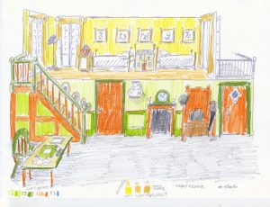
The answer to “could I use it?” was, could I turn it into a set that met the needs of the script. Here’s what the script calls for:
- A front door, for characters to enter and leave the house.
- A place to store the father’s hat, umbrella and briefcase—a hall tree.
- A fireplace (that can ingest pieces of paper, and even little children, when necessary)
- A clock
- A high shelf with “the heirloom”, an expensive China vase, on it
- A second, interior door
- A study with a desk and chair, where the father works on household matters
- A stairway leading to . . .
- . . . the nursery.
The nursery itself is described as cheerful, light and airy, with pleasant pictures. It needs
- Two beds
- A large dollhouse, that a child dressed as one of the children’s toys can pop out of
- A place for Mary Poppins to rest her bag
The script also calls for a balcony.
Here is a sketch, based on that platform, modified to be six feet deep, to accommodate the children’s beds, etc. Notice the colors used, just as in Larsson’s home: green and orange for downstairs, gold and yellow for the nursery.
Recently the production crew went to see the traveling Cameron/Disney production. I mentioned that my approach was different from theirs when it came to set design. Here’s an example: When Mary Poppins first appears and then takes the children upstairs to their bedroom, they disappear at the top of the stairs, there is a blackout; two large set pieces are rolled in from the wings, meeting in the middle to form the nursery; and Mary and the children appear there. This is a very impressive piece of stagecraft; very attractive and fun, in keeping with their aesthetic.
Well, our director, Keith Boyd, insists on keeping the dramatic pace moving, and on using blackouts only when absolutely necessary. Blacking out the set and making a whole new room appear onstage, just to move characters from one part of the house to another, would halt the action. Simply having the three walk up the stairs to the upper level of the set keeps the action moving.
So the repurposed platform appears to be able to support action inside the family’s home very well. But wait, there’s more!
There is an exciting scene in the kitchen, where one of the servants runs around madly, breaking everything in sight.
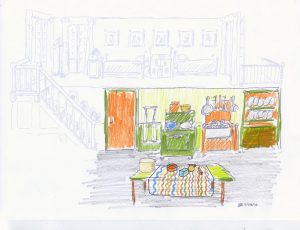
The father’s desk becomes the kitchen table. The front door is replaced with a trick cupboard, which the servant breaks, but is restored by Mary’s magic. The hall tree is hung with kitchen utensils and becomes the base for the kitchen sink. The fireplace is converted to a stove. And the shelf holding “the heirloom” becomes a place to store brooms, instead.
Other Sets
Other scenes in the musical require the use of drops. We plan on two: one dark set for the night and for the bank scene; the other shows the exterior of the house and the nearby park.
The night time drop will feature scudding clouds and a recognizable skyline. If you’re interested in seeing it, I invite you to come see the show. It opens November 4, 2016, and tickets are available now! at www.newberncivictheatre.org/.
