The color BLACK from an artist’s point of view
Here is a photo of my entry for the “ROY G BIV” art challenge sponsored by the Craven Arts Council. Come see it in person at the Bank of the Arts, 317 Middle Street in New Bern all through the month of May! (The show’s introduction is at Art Walk, 5:00pm on May 13th.)
Participants were given a 12-inch square and a mandate to use it to create a piece of art of a given color, part of that acronym: Red, Orange, Yellow, Green, Blue, Violet—plus Black and White. My color was black.
Let’s just think about that for a moment. In society at large every color has emotions and connotations. None more so than black. I’m not going there.
In terms of design and fashion, black is high on the list: “the little black dress,” black leather jackets and boots, cars with black-on-black insignias . . . The list goes on. Been that way for decades. “Orange is the new Black!” or yellow, or even white. No. Get over yourself. It’s Black, period.
In art it’s a different story. For literally ages. It’s just the go-to color. Our eyes see shapes, contrast. What better than to black for delineating shape and color? And making black is as easy as it gets. Collect soot on the glass walls of a burning lamp. Or the ceiling of your cave. The first artists drew with sticks of charcoal, and we still do.
I used my 12-inch square to explore this color from an artist’s point of view. Here it is:
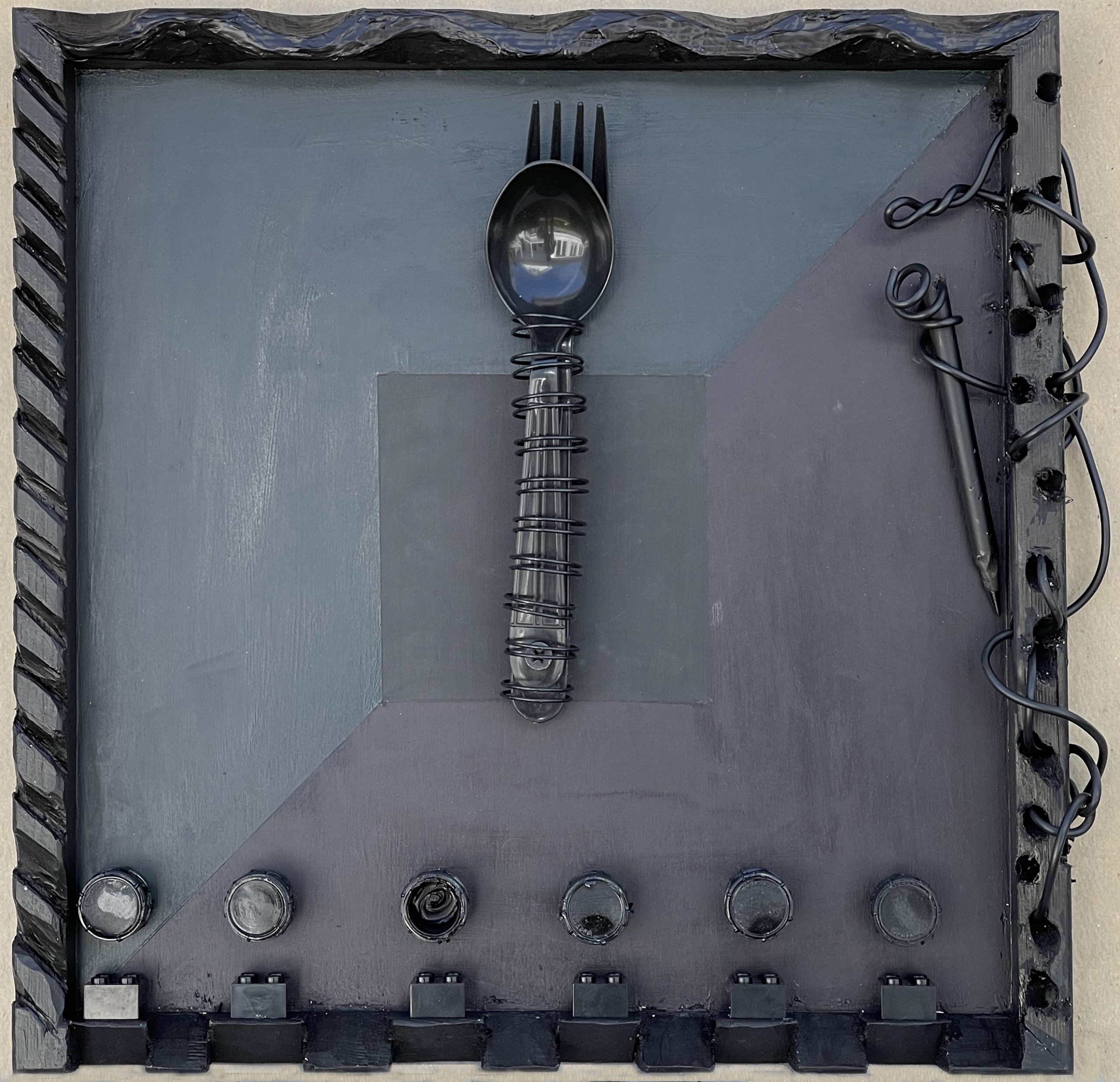
I took as my guides a number of artists of the last century, in particular Ad Reinhardt, Louise Nevelson, and Pierre Soulages, who all were noted for making totally black art. I also tapped Jasper Johns and the Dadaists.
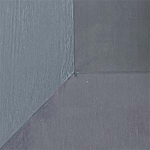
Now some artists I know will say “Black is not a color.” Ad Reinhardt dispelled that notion with his square paintings that looked totally black from a distance, but revealed colors when you came closer. As a nod to him the middle of my square contains three very different blacks. The very center is a pure, single-pigment paint, PBK7 to be precise. Being non-reflective, it’s technically the blackest black in the painting. It’s surrounded by two “chromatic” blacks that artists often use for the darkest parts of a painting.
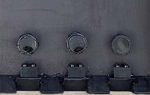
Louise Nevelson made works of art comprised of stuff she found, arranged in fascinating ways, then all painted black. Hardware-store black I suppose you’d call it. By turning my 12-inch square the wrong way ’round it made me a Nevelson-style frame, and in Nevelson’s style I sprayed some of the bits with Rustoleum.
Pierre Soulages is famous for large panels of shiny black metal or acrylic plastic, covered with waves or other shapes. He loves the way those shiny black surfaces reflect colors and light. I carved three edges of that frame with different shapes and painted them with shiny black acrylic to mimic his method.
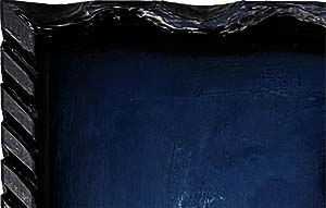
The fourth edge is painted with Chinese “India” ink. It’s made with that soot I mentioned earlier. I admire Chinese and Japanese paintings and calligraphy, so I needed to visit that in this exploration.
Some of the items I found to put into the frame bring me to Jasper Johns: the black wire, spoon and fork. I know he’s not famous for painting in black, but I couldn’t let it go. And that’s where that mess on the right side comes from, too.
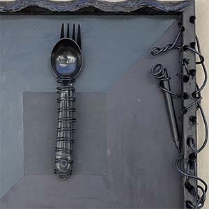
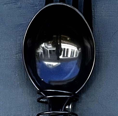
The name of the piece, See yourself in a spoon, is a nod to 20th Century artists like René Magritte, who, like me, enjoy a bit of fun.
