It’s been a while . . .
I look at my site and see I’ve really neglected it. Haven’t even finished the story of our trip! Just to let you know, it was great, and I will get around to filling in the blanks, including: revisiting ancient Angkor, cruising the lower Mekong, sights in Vietnam — and the wedding in Australia!
And then I hope to catch you up on what’s happened with us (not a whole lot) since coming home to a raging pandemic, and trying to come out the other side (we both have stayed healthy throughout).
But first . . .
I’d like to share something I’m excited about. I’ve discovered the art of John Lovett (johnlovettartist.com). It speaks to me. I really like the effects he achieves.
One of the collections of images on his website is a set he calls “Desert Sketches.” They are mostly quite abstract — the only landmark I could identify in any of the sketches was Uluru, in one picture. What grabbed me was his use of line, and combining watercolor with opaque paint, and the atmospheric effects he achieves, I think with the use of gesso.
So I set out to fill a notebook with drawings and paintings using some of the effects I see in that collection. I began the notebook on July 9, completed on the 29th. Here are some samples: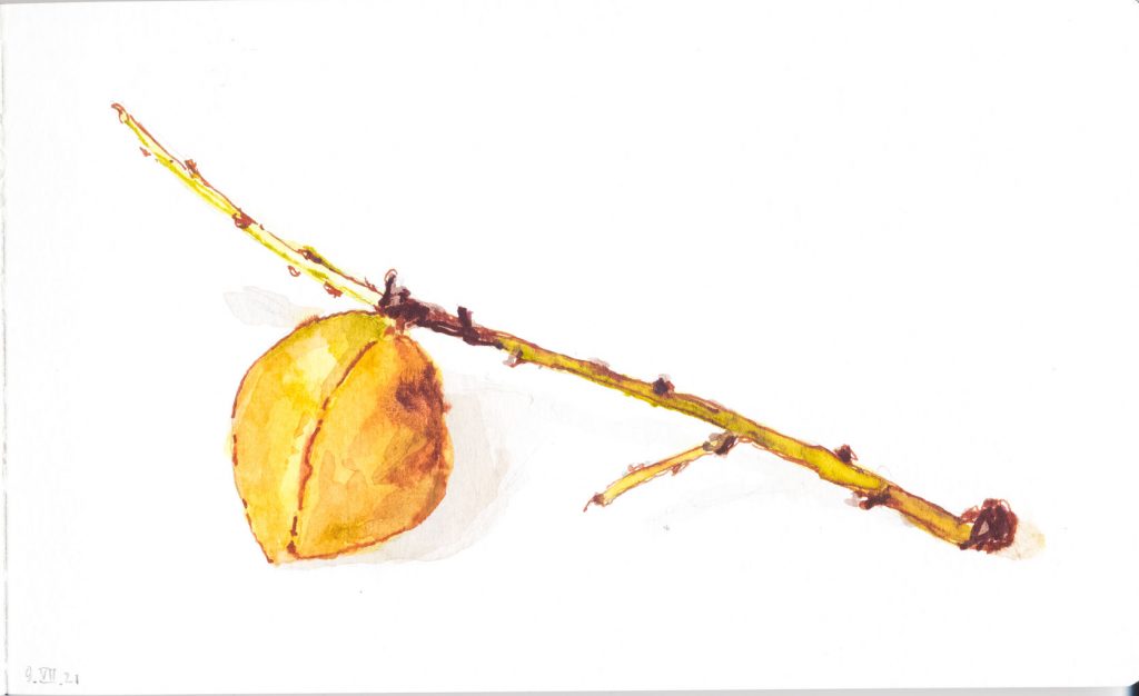 The Last Peach
Our peach tree in sad shape. It produced just one peach, which I drew here using Burnt Sienna ink as well as transparent watercolor.
Using some of the techniques I saw in Lovett’s sketches, I revisited an image from our visit to Java. Here I’m using gesso to create white and to make the yellow opaque over the dark background.
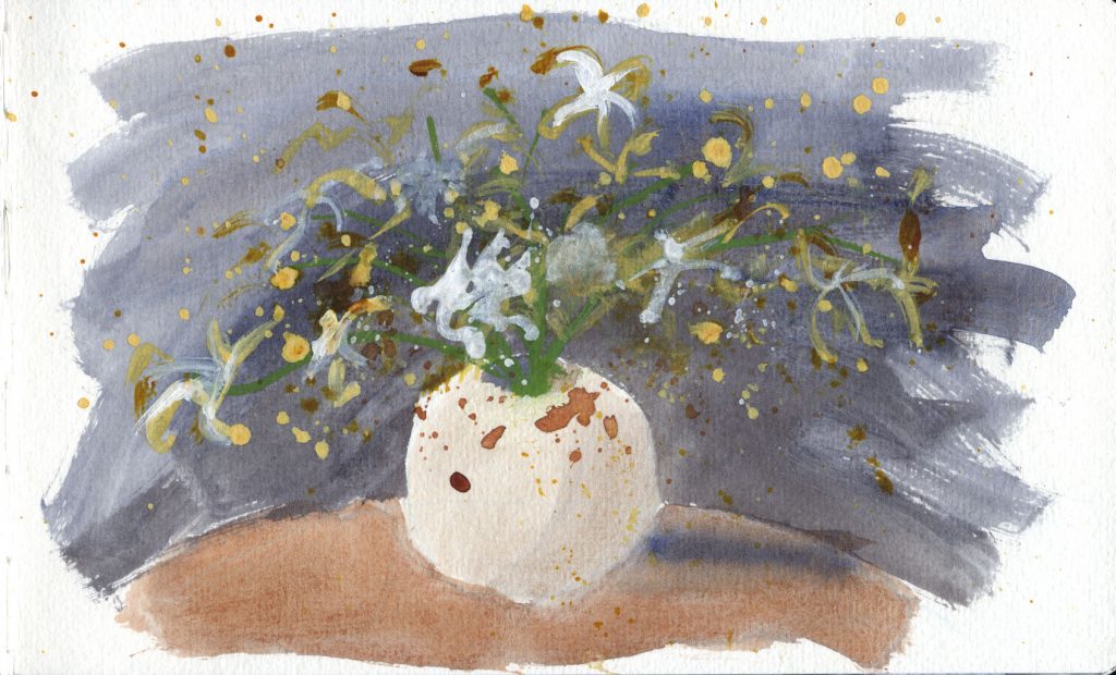
Here both brown ink lines and gesso are used, in this case to add texture and atmosphere.
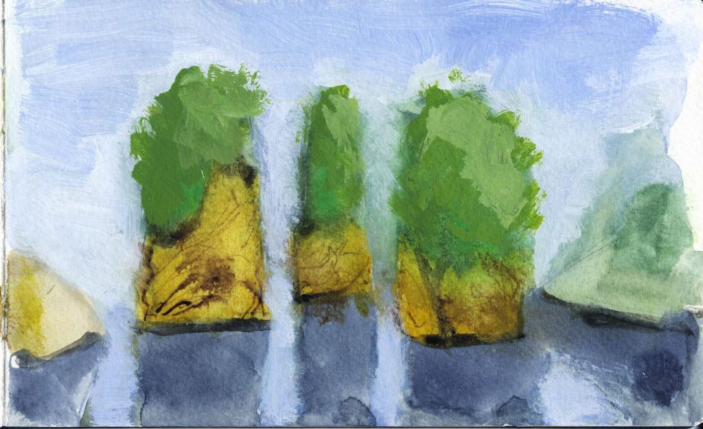
One of my favorite topics, the Great Wall. The gesso helped with atmospheric perspective.

Here I’m mimicking one of Lovett’s sketches, a monochrome done in transparent iron oxide watercolor and gesso. Interesting how the gesso seems to add an an additional hue.
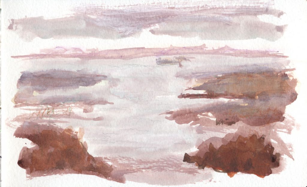
A panorama showing a dock and the Trent River at New Bern NC, using minimal detail in the painting, but with ink for details and texture.

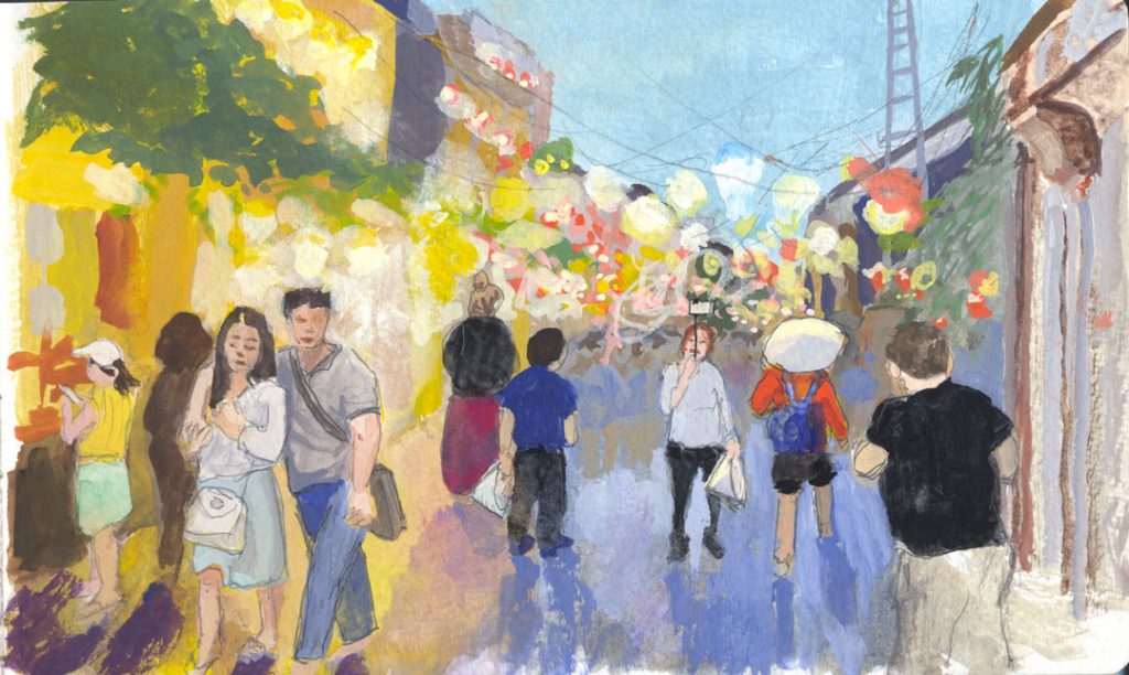
I tried using gouache — a medium I’m not used to — with gesso to give the idea of the hundreds of colorful lanterns lighting this famous Hoi An street at dusk.
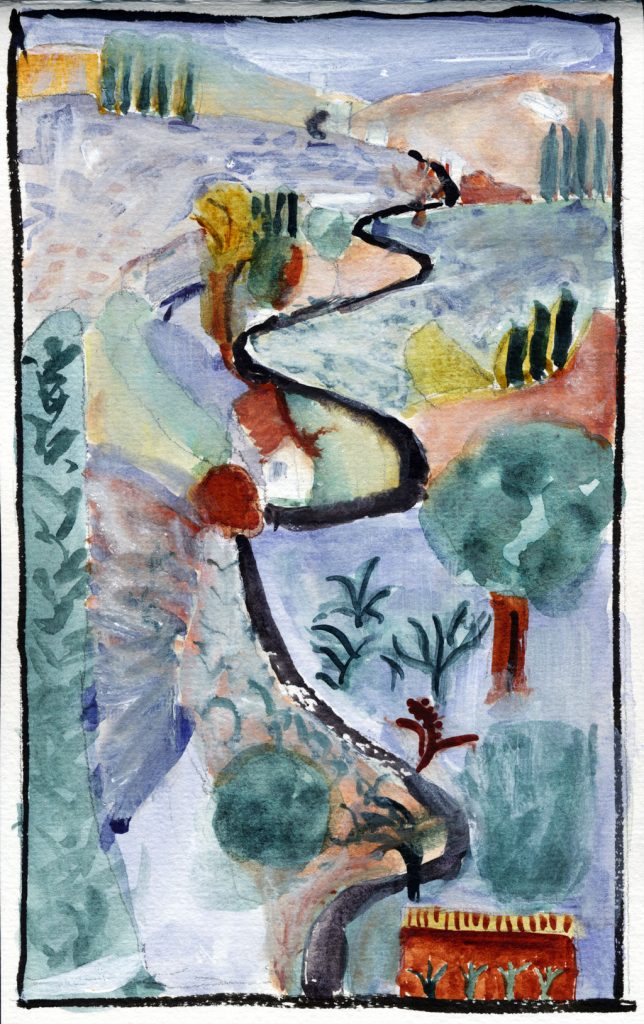
This watercolor, patterned after another landscape artist’s work I admire, uses added pen and pencil lines for impact, as well as gesso for atmosphere.

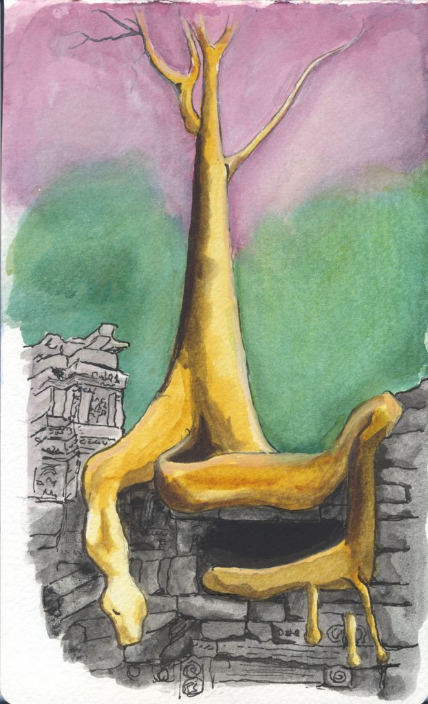
Using strong line work to heighten the drama of a giant fig’s roots invading the ruins of the ancient Ta Prohm monastery in Angkor.
Another contemporary artist I admire is David Hockney. What if he used the kinds of colors and techniques that John Lovett does?
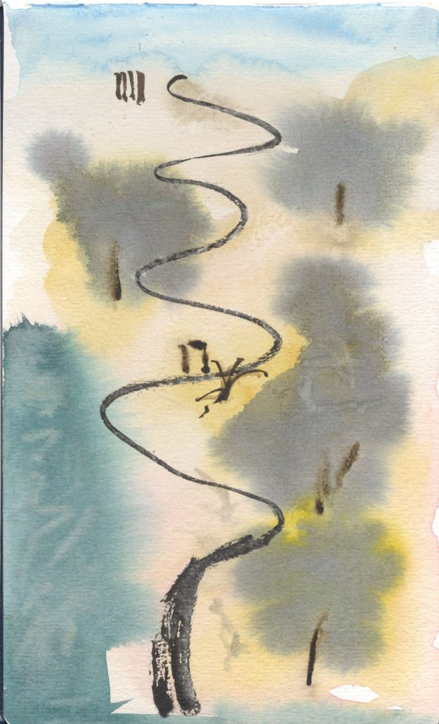
Now what if Lovett painted that picture to begin with. What might it be like?
Using both strong ink lines and gesso to give this scene of a New York beach a rough, hard feeling.
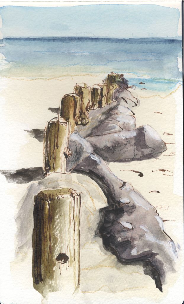
Here I’m experimenting with ink on a surface of tinted gesso. I wonder if silverpoint would work on dark-colored gesso. But I’ll leave that for another time.
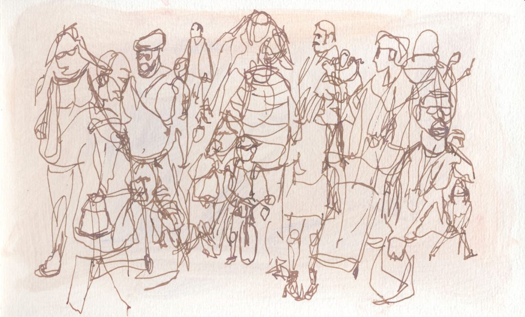
The point of most of my art is to capture events and scenes from Mary and my travels. We recently took a Caribbean cruise (!) and here’s Mary enjoying a swim off the back of the boat. I think line work can inject a bit of fun to a drawing, as well.
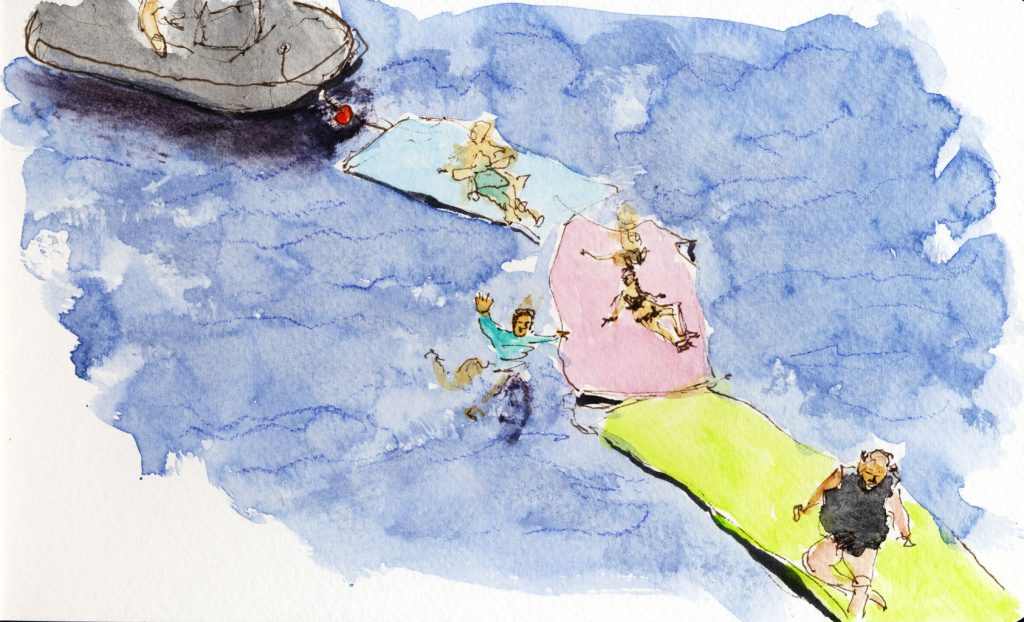
Speaking of fun, here I’m using Lovett’s propensity for big fuzzy blobs of color to create a more informal image of the Dance Center Building (known as “Fred and Ginger” by locals) in Prague.
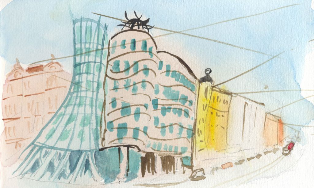
In this watercolor I’m exploring Lovett’s propensity for minimalism.

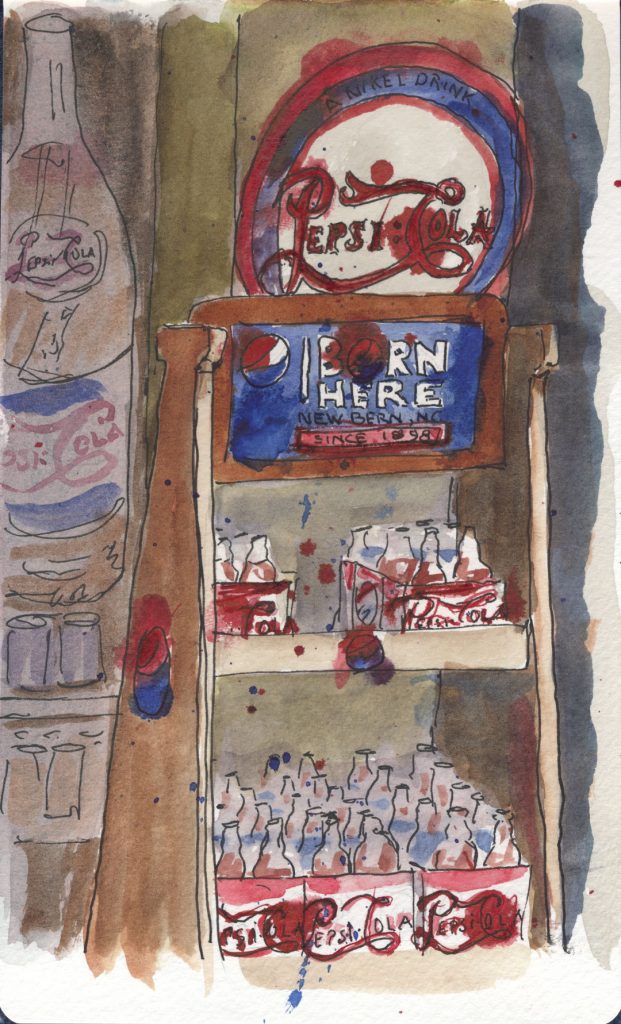
More fun: In this ink-and-wash of the local Pepsi store I’m channeling Ralph Steadman.
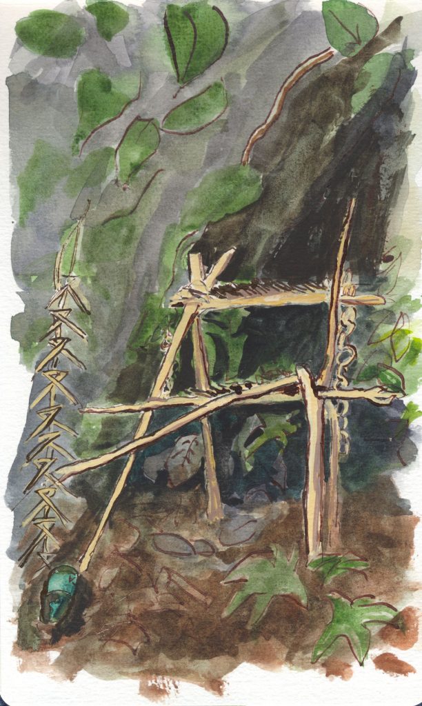
Here is a scene I’m revisiting: an altar in the jungle of Northern Thailand, made of sticks and woven bamboo. Someone has left an offering to the spirits of a bottle of green Fanta. Growing up Catholic, my image of an altar was a very permanent structure, a scrupulously clean and tidy thing. This has a different kind of feeling altogether; but that’s also a discussion for a different time. I hope I captured the wild nature of the place, and a different kind of spirituality than I’ve known.
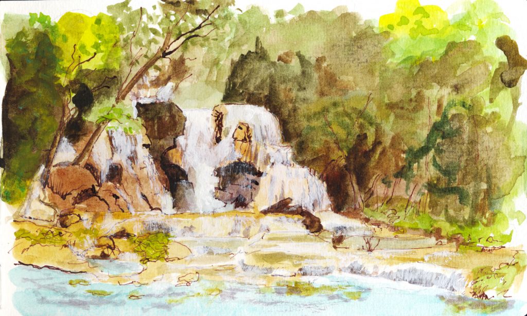
Another jungle scene: Here I’m trying to convey the scraggly vegetation as well as the hardness of the rocks with ink, and using the transparency and texture of gesso to convey the look of the falling water.
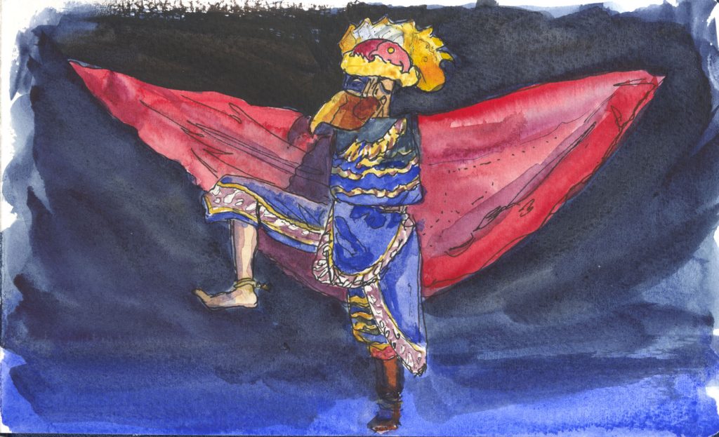
I’ve wanted to paint this character for a long time, but before seeing Lovett’s use of line to convey energy and motion, I didn’t have a way to do it. I wish this scan could have captured more of the intensity of the original.
Well, there you have it. Pages direct from my Pentalic sketchbook, in the order in which they appear there. Yes, I was intentionally trying a wide array of topics, places and techniques. It’s a sketchbook after all, a place for experimentation.
I hope you enjoyed it!
